a blog by fellows working at the ERC
-
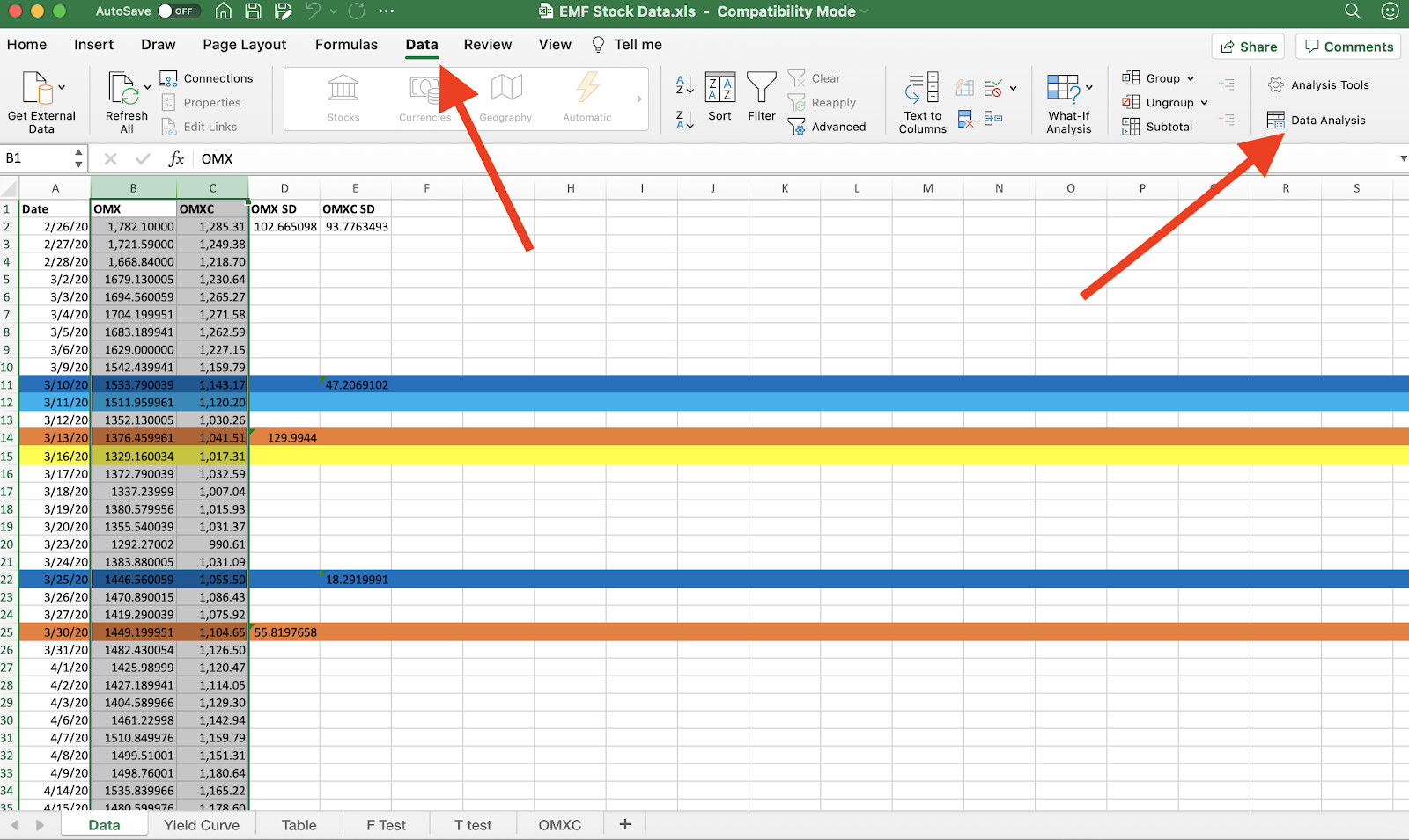
How to run an F-Test in Excel using data from the OMX and OMXC indices
By Neeti Kapadia We will be running an F-test on two stock indexes from Denmark and Sweden on their closing prices data from March through May 2020. More specifically, we will be looking at the closing prices of their most traded stock indices, the OMXC and OMX respectively. Both Denmark and Sweden are quite similar…
-
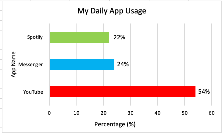
Good Graphs vs. Bad Graphs
By Sultana Mohammed Many times in working world graphs are used to show changes in data over time, however, sometimes these graphs don’t capture the full picture and can be misleading. A good graph should tell you a story, it should be able to be read on their own and still be understandable. Graphs, however,…
-
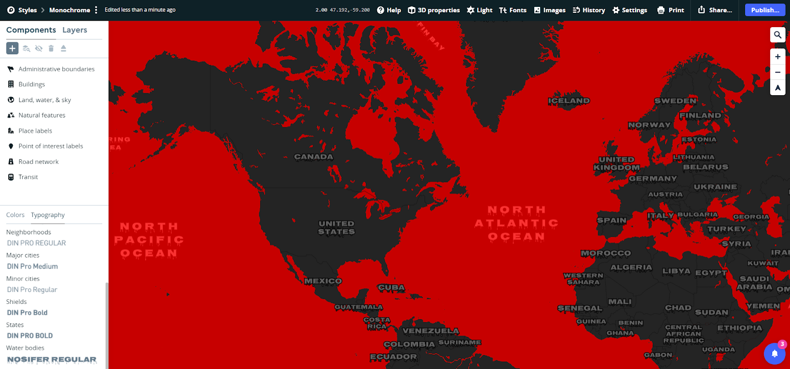
Spooky MapBox Workshop
Led by Maddy Liberman, Undergraduate ERC Fellow Today we will be using Mapbox to make custom Halloween-themed maps! Mapbox is a web browser map platform. Many apps and websites use it for basemaps, such as CNN, Instacart, and the New York Times. I’ll show you some examples from https://www.mapbox.com/showcase. Mapbox has many advantages in that…
-
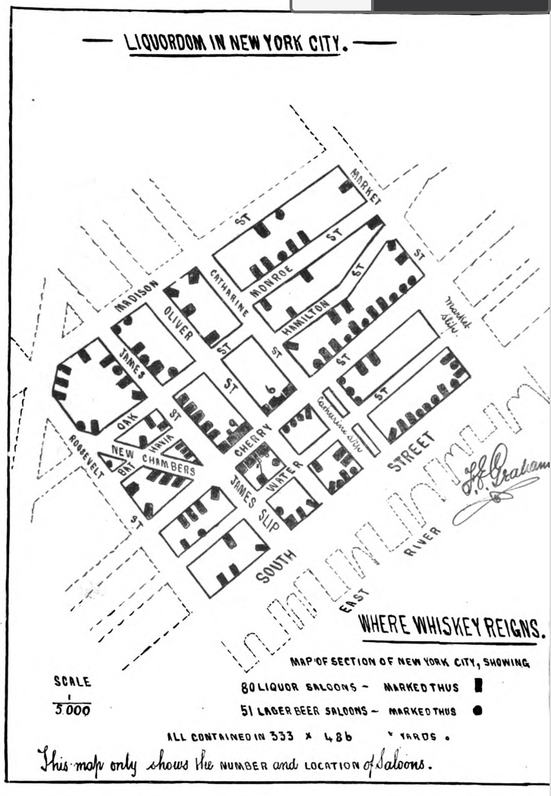
Historical GIS Workshop
By Maddie Liberman In this workshop, we create a map with different kinds of historical data. We will use this to see the change over time in a specific area of New York. We’ll start out by downloading our data sources. We will be georeferencing a historical map and looking at the locations of saloons…
-
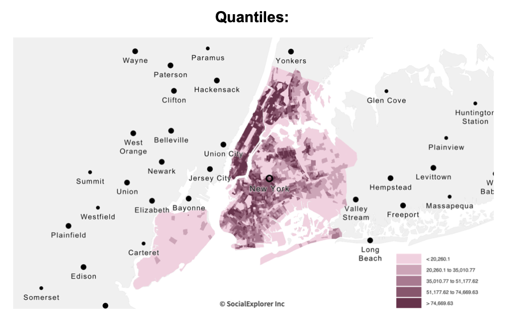
Breaking Down Your Spatial Data
By Amelia Marcantonio-Fields As I was assisting with summer Pre-College data exploration courses and developing QGIS workshops for a course, I had to re-familiarize myself with the methods behind the standard data breaks in GIS. I got the question of what breaks and when to use them often this summer, and I hope this extra…
-
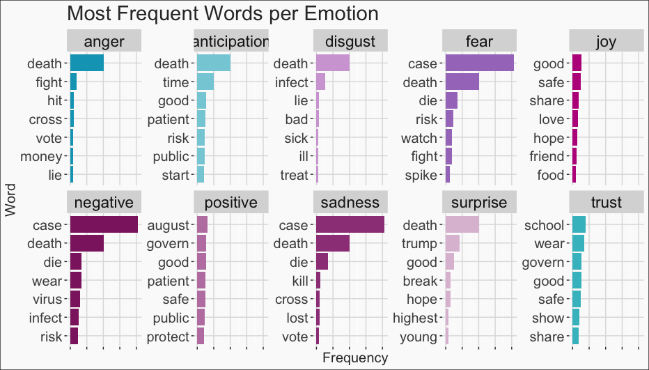
Twitter Sentiment Analysis in R
R sentiment analysis on Twitter data using the hashtag #covid19 with Twitter API
-
Lessons Learned from Online Learning/Teaching
By Amelia Marcantonio-Fields It’s crazy to think that we’re now almost in a month into the 2020-21 school year! The ERC computer lab has been closed now since March 2019 and we have fully immersed ourselves into online learning, which has turned into an exciting way to refine and adjust our teaching methods! This summer…
-
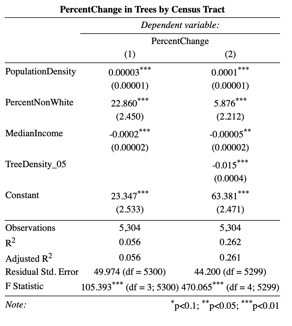
R Analysis on NYC Street Trees
By Maddie Miley The New York City Street Tree Census has been conducted every 10 years since 1995. The Street Tree Census was created in order to count the number of street trees in the city as well as their species, diameter, and condition. Since its inception in 1995, the Street Tree Census has proven…
-
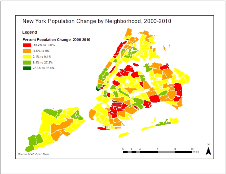
Intro ArcMap Tutorial
Tutorial on how to visualize tabular data in ArcMap by joining it to a shapefile (a spatial data file) using 2010 census data by NTA and the percent population change between 2000 and 2010.
-
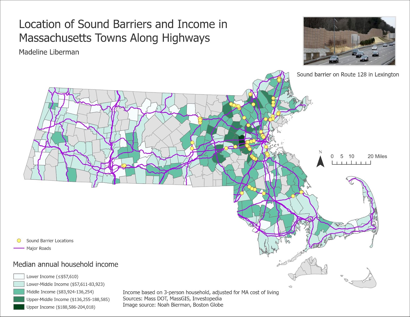
Mapping Noise Barriers and Income in ArcGIS Pro
Arc pro analysis on distribution of highway sound barriers in relation to median household income