By Maddy Liberman

Smith-Midland Corporation. https://smithmidland.com/images/Smith-Midland-Sound-wall-panels.jpg.
You’ve probably driven by these on the highway at least once in your life. Maybe you thought they were just some kind of wall or fence, or maybe you didn’t even notice them. This is actually a highway noise barrier; they’re often placed next to highways to reduce noise pollution in nearby towns. Most of the time I wouldn’t give them a second thought. But one day while driving down the highway, my dad mentioned in passing that only certain towns have those barriers if they have the funds to build them.
The great thing about learning some basic data analysis tools and software is that you have the power to put nearly any question you come up with to the test yourself. My dad’s comment stuck in my mind, so I decided to try to explore it more through some maps. I was curious if his hypothesis would hold up in Massachusetts, my home state.
But why would this even matter much? Well, noise pollution may not be as tangible as other forms of pollution, but it can have huge effects on quality of life. Higher noise exposure is linked to many physical and behavioral issues, including sleep problems, high blood pressure, and even low birth weights. And researchers have found that noise exposure and its effects are not distributed equally across the population: lower-income neighborhoods and communities of color have greater noise exposure on average (Casey). The reasons for this correlation, however, are not obvious. I wondered if higher-income communities in MA tend to have more and longer noise barriers, and if this causes unequal exposure to highway noise. So I turned to ArcGIS Pro, my current go-to software for spatial analysis.
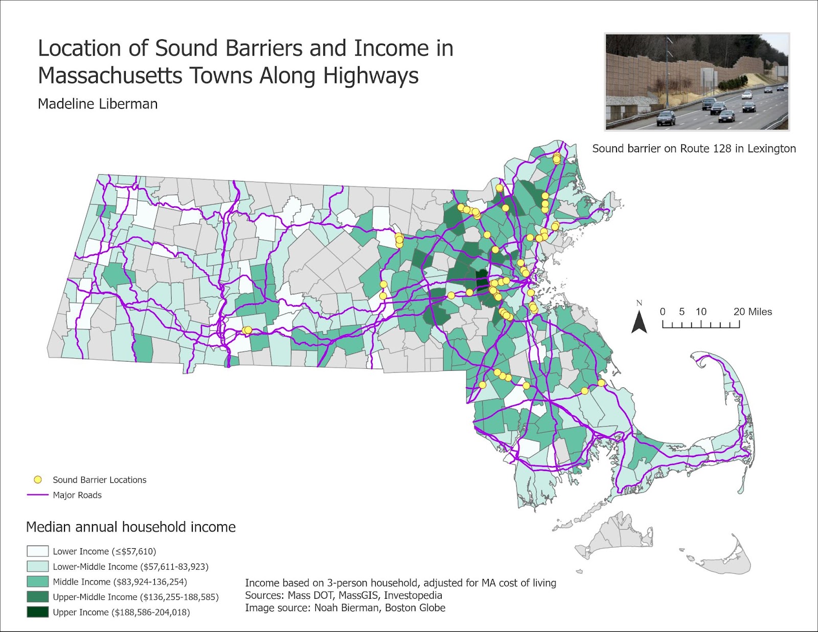
First, I needed to actually figure out where the noise barriers were. From the Massachusetts Department of Transportation, I found a list of the approximate locations of the barriers in relation to the nearest street in the neighboring town. I then turned to Google Maps and found the exact locations using satellite imagery and Street Views. I traced the barriers with line segments as accurately as I could and made a layer of those segments in My Maps.
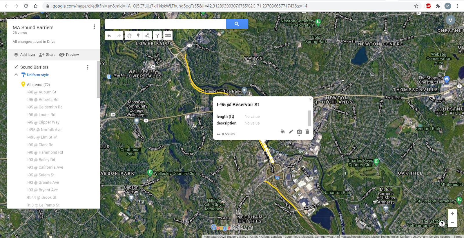
One great thing about Google Maps is that the layers you create can be downloaded easily as KML layer files and brought into GIS software. You just choose “Export to KML/KMZ”, choose a layer, and check off “Export as KML.” Then, you use the KML to Layer conversion tool (this will work in ArcMap, too!).
Once I had my noise barriers in a layer in AGP, I changed the symbology to make the layer easier to see. I then grabbed shapefiles of town outlines and major highways from Massachusetts’ GIS portal.


Next, I wanted to find out which towns had the most of their highway covered by a noise barrier. This took quite a few steps, but none of them were too difficult. However, this might be a little tricky if you are new to ArcGIS or ArcGIS Pro specifically, so come to the ERC if you have any questions about trying this for your own projects. I first cut the highway layer into segments by the town outlines, using the Intersect tool. I performed a spatial join to join these line segments to the town polygons and summarized by the line segment length field. This created a new layer containing only towns that had highways running through them, and it added the attributes of the line segments to this polygon layer- including the combined length of all the highways in that town.

I used the length of each of those highway segments to normalize the length of the noise barrier segments (in other words, I divided the noise barrier lengths by the total highway length for each town). Since this data was joined to my towns layer, I could visualize the towns by their ratio of noise-buffered highway to total highway.
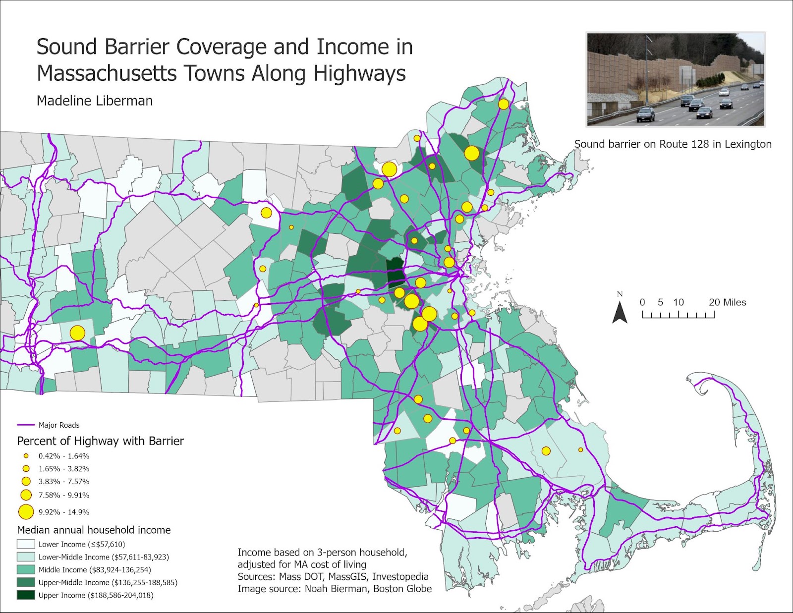
Many of the towns with the highest percentage of noise barrier coverage are upper-middle income, and most of the towns with the least coverage are middle- or lower-middle income. Only one lower-income town has a high ratio of noise barriers to total highway length.
I also created another version of the map that shows the locations of the noise barriers. For this map, I actually created a point in the center of each noise barrier line segment, because the noise barriers were so short at this small scale.

From the second map, it’s clear that all of the noise barriers are concentrated in the northeastern part of the state. There seems to be a general clustering of noise barriers in towns with higher income levels.
From these maps, it seems that my dad’s observation holds some weight. But interestingly, the Massachusetts Department of Transportation says that it builds noise barriers with state funding, based on its survey of which areas are most affected by highway noise (“Noise Abatement Programs”). The wealth of individual towns doesn’t seem to have much to do it! I’m curious, then, why this general trend seems to appear, and I have more to explore. But hopefully you can now see how to take an idea and create a map with some analysis!
Sources
Casey, Joan et. al. “Race/Ethnicity, Socioeconomic Status, Residential Segregation, and Spatial Variation in Noise Exposure in the Contiguous United States.” Environmental Health Perspectives, vol. 125, no. 7, 2017.
“Noise Abatement Programs.” Mass.gov, https://www.mass.gov/service-details/noise-abatement-programs#:~:text=The%20Type%20II%20Noise%20Abatement,from%20traffic%20along%20interstate%20highways. Accessed April 6, 2021.
Data Sources
Sound barrier locations: https://www.mass.gov/doc/noise-abatement-inventory/download
Towns: https://docs.digital.mass.gov/dataset/massgis-data-community-boundaries-towns
Major roads: https://docs.digital.mass.gov/dataset/massgis-data-massachusetts-department-transportation-massdot-roads
Leave a Reply