By Maddy Liberman
This tutorial visualizes tabular data in ArcMap by joining it to a shapefile (a spatial data file). Joining data means integrating two kinds of data based on a common feature. In this tutorial, the common feature is a neighborhood tabulation area (NTA) code.
The data we will be exploring is from NYC Open Data. It has 2010 census data by neighborhood; we will be exploring the percent population change between 2000 and 2010. By joining this data to a map of New York neighborhoods, we can see if there are any spatial patterns in the population change.
Links to data sources:
Census demographics: https://data.cityofnewyork.us/City-Government/Census-Demographics-at-the-Neighborhood-Tabulation/rnsn-acs2
Neighborhoods shapefile: https://data.cityofnewyork.us/City-Government/Neighborhood-Tabulation-Areas-NTA-/cpf4-rkhq
- To begin, use this link (you might need to log in with your UNI) and follow the instructions to open Apporto. Then scroll down to ArcMap 10.7.1 and click “Launch.”
- In Apporto, download the zipped folder from the ERC Github and extract it to the folder you are working in. Keep all the files together. One shapefile consists of many different files (.shp, .dbf, .prj, .qpj, .shx) and ArcMap will need all of them to read the file. There will also be a .csv file; that’s our census data.
- In the “Getting Started” window, click “Blank Map.” You can keep the default geodatabase.
ArcMap has two main panes: the main window on the right and the Table of Contents on the left. The table of contents shows all the different layers that you’re working with: shapefiles, .csv files, or others.
To add in our data, click “Add data” on the top pane. Navigate to the folder where you saved the data by going to the “Look in” dropdown. If you don’t see the right folder, click “Connect to folder”
and add it in the navigation pane. When you’ve found your data, notice that there is now only one file for the shapefile. Add the shapefile and the .csv file to the map. You should see the NYC neighborhood outlines (the color doesn’t matter).

- Right click the neighborhoods layer and click “Open Attribute Table.” Take a look at the fields: each polygon has a borough and neighborhood name associated with it, as well as a four-character code. Close the attribute table.
- Now we’ll look at the census data table. In the Table of Contents, only the neighborhoods layer shows up. To see the census data, click “List by Source”
under the Table of Contents heading. Now you should see the data table. Right click on it and choose “Open.” Take a look at the fields here: again, we have the borough and neighborhood names and the NTA code. The table also has 2000 and 2010 population data, including the population change in numbers and percentages. Close the table.
- Now we’ll join the .csv file to the shapefile. We want to add the census data onto the data for the neighborhoods, so we start the join by clicking on the neighborhoods layer. Right click the neighborhoods layer in the table of contents and navigate to Joins and Relates -> Join… Choose “Join attributes from a table.” For the field to base the join on in the neighborhoods shapefile, choose “ntacode.” Choose the census data for the table and “Geographic Area- Neighborhood Tabulation Area (NTA) Code” for the matching field in the census data table. The selections should look like this:
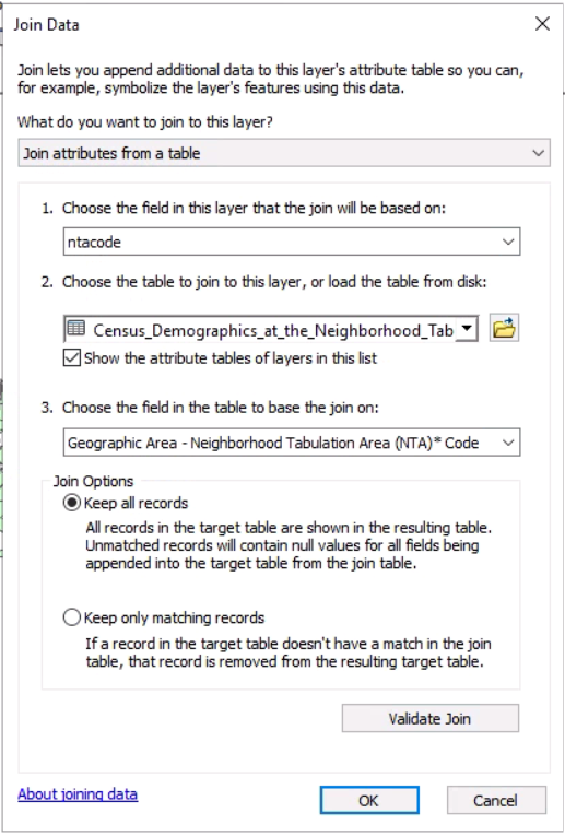
Click “Validate Join.” A warning message will appear, but you can ignore it and click “OK.”
- Right click the neighborhoods layer and click “Open Attribute Table.” Scroll all the way to the right. You should now see the fields from the data table at the end of the attribute table. Now we can use values from the census data in our visualization of the neighborhoods.
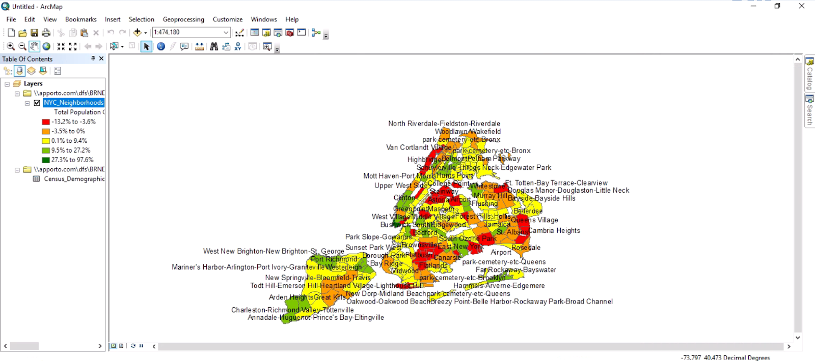
- Right click the neighborhoods layer and click “Properties.” Go to the “Symbology” tab and click “Quantities” on the left. We’ll use the first option, graduated colors; this is a basic color scale where a change in color corresponds to a change in the data values. Under “Fields,” click “Total Population Change 2000-2010 Percent” for Value. Next to “Color Ramp,” choose the green to red color ramp. However, green is automatically applied to the most negative percent value, which doesn’t make sense. To change this, right click on “Symbol” and click “Flip Symbols.”
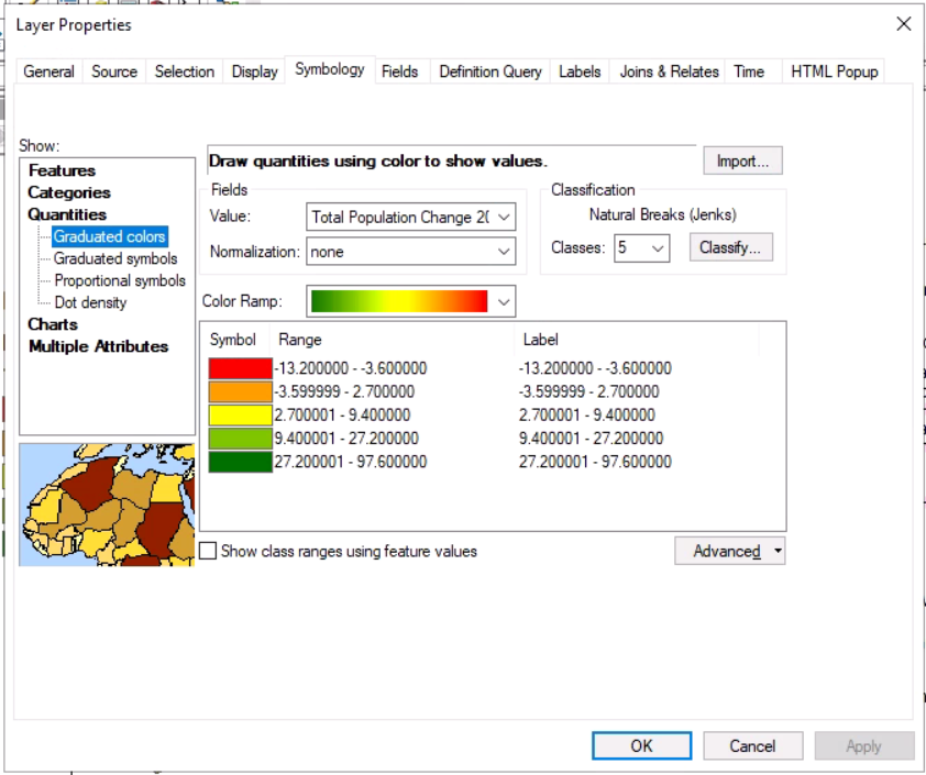
- Right now, the color scale is broken into five classes by “Natural Breaks (Jenks).” This is just one way of creating categories for the data. However, the automatic classification does not always make sense for the data, as is the case here. The second class ranges from about -3.6% to 2.7%. We would probably want to separate negative and positive values, as it makes sense to associate red with negative change and green with positive change. To do this, click “Classify.” Under “Break Values,” change the second value to 0 and click “OK” twice. Now there is a category for 0.1-9.4% change.
- Now we want to change the labels so that the map legend is easier to understand. Right click “Label” and click “Format Labels.” Under “Category,” click “Percentage.” Keep the selection on “The number already represents a percentage”. Click “Numeric Options” and under “Rounding,” change the number of decimal places to 1.
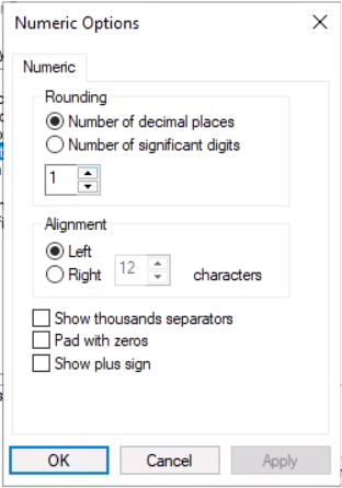
Click “OK.” In the “Number Format” window, click “OK” again. Your window should now look like this:

- The labels look better, but there are two hyphens in a row in the first label. Replace the hyphen with “to” in all of the labels:

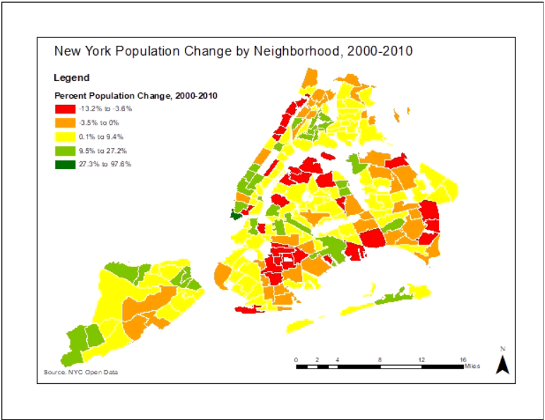
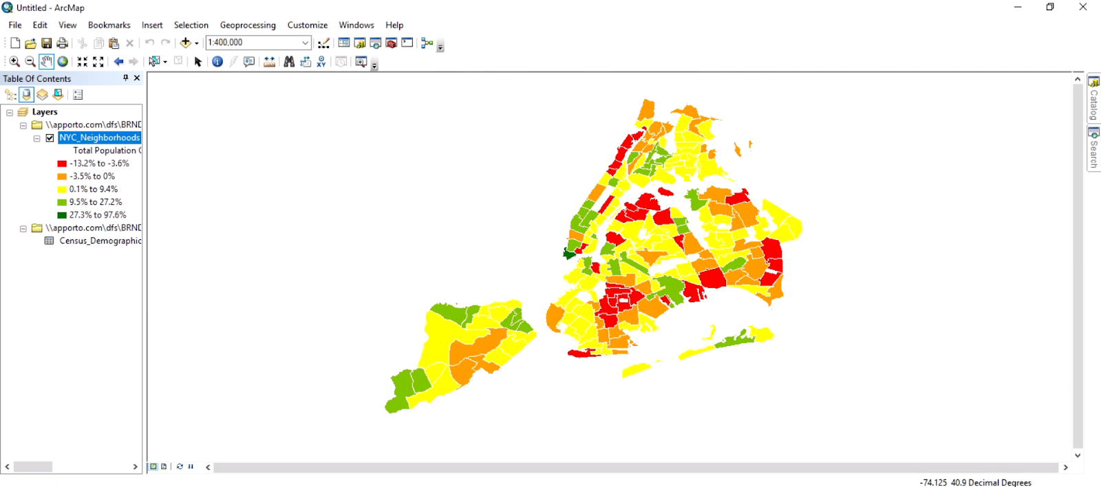
- Click “OK.” The map should look like this:

- Let’s add labels to the neighborhoods so we can see which neighborhoods are which. Right click on the neighborhoods layer in the Table of Contents and click “Properties.” Go to the “Labels” tab. Check “Label features in this layer” and choose “ntaname” for “Label Field.” Under “Text Symbol,” change the font size to 10. Click “Apply” and “OK.”
- Zoom in using the scroll wheel on your mouse or the Zoom In button
at the left of the toolbar (which zooms to the area you draw a square around). Look around the map- what do you notice? Which neighborhoods have the most negative change (population decrease) or positive change (population increase)? When you’re done, right click on the neighborhoods layer again and uncheck “Label features in this layer.”
- Let’s prepare the map for display. First we’ll make the neighborhood outlines look a little nicer. Right click on the neighborhoods layer and click “Properties.” In the “Symbology” tab, right click on the first symbol (the red square) and click “Properties for selected symbols.” Click on the grey box next to “Outline color” and change it to white, then click OK. Repeat for each symbol.
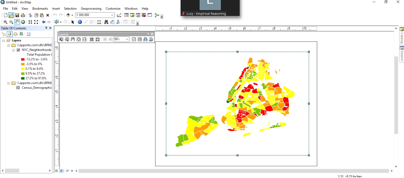
- On the toolbar below the main map pane, click the second icon from the left so that it is highlighted in blue
. This changes the display to layout view.
- Right click the map (outside of the border) and click “Page and Print Setup.” Under the “Map Page Size” heading, change the orientation to Landscape and click OK.
Use the Select tool
to select the map; the outline will change to a broken line. Use the squares on the edges to drag the map frame to be within the page.

Use the pan and zoom tools on the main toolbar to change the view of the map within the map frame so that it is as large as possible within the frame.
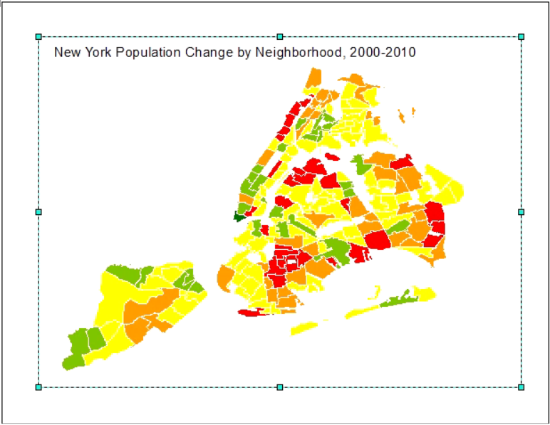
- Now we’ll add some elements that are necessary for understanding the map. On the top panel, click Insert -> Title. Title the map “New York Population Change by Neighborhood, 2000-2010” and click OK. Drag the title within the border, then double click on it. Click “Change Symbol.” You can change the font and the font size; then click “OK” twice.
- Click Insert -> Legend. Click “Next” four times and then “Finish” without changing anything. Right click on the legend and click “Convert to graphics,” then click “Ungroup.” Delete the layer name underneath “Legend.” You can change the legend description if you’d like; just make sure to select all of the legend parts and regroup when you’re done editing.
- Next we’ll add a scale bar and north arrow. On the toolbar, click “Insert” and “North arrow.” Choose one you like, click OK, and drag it to the corner of the map. Do the same for the scale bar.
- Click “Insert” and “Text.” Type in “Source: NYC Open Data.” It’s important to cite your data source!
- Now your map is ready to export. You can do this through File -> Export Map. To save the map, simply go to File -> Save As and save to your preferred folder.


Leave a Reply