
By Amelia Marcantonio-Fields
As I was assisting with summer Pre-College data exploration courses and developing QGIS workshops for a course, I had to re-familiarize myself with the methods behind the standard data breaks in GIS. I got the question of what breaks and when to use them often this summer, and I hope this extra research and information that I have distilled will be useful to you as you embark on your future mapping projects.
There are four standard data modes or “breaks” that can be used to visualize your data: Manual, Equal Internal, Quantile, and Natural (Jenks). There are no right or wrong answers when it comes to data breaks, but there are best practices that will help enhance your visual arguments.
Firstly, we need to discuss the amount of breaks that are recommended when mapping. Again, there is no right or wrong answer to this question, but for readability, I recommend 5-6 breaks maximum for best color differentiation.
Manual: Using Manual Breaks means that the map author is able to define their own classes. This method is good for working with data that has breaks determined by an outside institution ie: tax breaks or income breaks.
Equal Interval: Equal Interval will divide the classes into equal sized subranges. This works well for data broken into percentages or visualizing temperature. Percentages using 5 classes would be broken down as: 0-20%, 20-40%, 40-60%, 60-80%, 80-100%.
Quantile: The Quantile method will make sure there are an equal amount of features per class. Quantile maps can often be misleading and the process of adding more classes will increase the nuance. However, while the map might have truer representation with more classes, it could be harder to read.
Natural (Jenks): Natural Breaks (or Jenks Breaks) is determined based on an algorithm and functions as the middle ground between Equal Interval and Quantile. Breaks are determined by finding “big differences in the data values”. Natural Breaks become data specific and are not recommended when comparing maps.
To show you the intense difference that breaks can have in your visuals, I quickly generated a few 2019 Population Density (people per sq. mile) maps in Social Explorer:

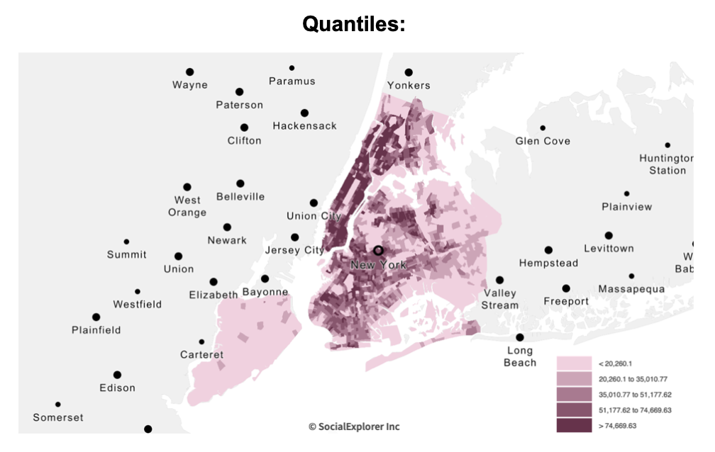

In my reading of these three maps, Equal Interval makes New York City seem much less dense than it is and Quantile breaks makes it look like most New York City is incredibly dense. In this case, I would choose Natural Breaks as I think the Natural Breaks option offers the most nuance for the city as a whole (and I am not comparing this map to anything else)!
For more help on this topic, see my sources or the ERC walk-in hours!
Leave a Reply