By Sultana Mohammed
Many times in working world graphs are used to show changes in data over time, however, sometimes these graphs don’t capture the full picture and can be misleading.
A good graph should tell you a story, it should be able to be read on their own and still be understandable. Graphs, however, can be manipulated to fit the original postings agenda and can generally be hard to read sometimes. In this blog post, I would like to review some good and bad graphs and then give examples of how a bad graph can be changed to be easily readable. I also am highlighting the “low information to ink ratio” model to help edit graphs to be more understandable.
Some misleading graphs seen in the world can be found in new articles or on new programs on TV. In 2011 Fox News broadcasted a graph trying to highlight the rise in unemployment rate under the Obama administration. The graph highlighted below is hard to read and is misleading the audience to believe that after a small dip in March there was a rise in unemployment in following months.
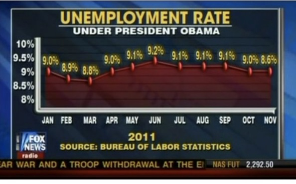
Some bad features about this figure:
- The y-axis scale is too small to really see a trend
- The colors of the graph are clashing with the background color in the news program
- Some of the values have been plotted incorrectly
- This graph is general is showing a growth trend even though there isn’t one
Now if we were to remake this graph correctly and to highlight what the data actually is saying it would look a little something like this:
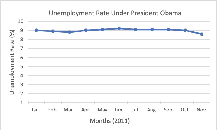
Changes made to this figure:
- A more reasonable y-axis scale
- A neutral background was used
- The coloring under the data points were removed
- Axis’ labels were added
This graph now highlights how unemployment didn’t really see much change in 2011 under the Obama administration, unemployment rates actually stayed pretty stable at around 9%.
The rule I followed to format the aesthetics of this graph is called the “low information to ink ratio” model, where junk kept to a minimum and little to no distracting features are visible. Some ways to implement a low information to ink ratio model in your own graphs is to erase distracting gridlines, making sure not to have redundant coloring or labels, choosing a natural background color or no background color and making sure all the information is easily readable.
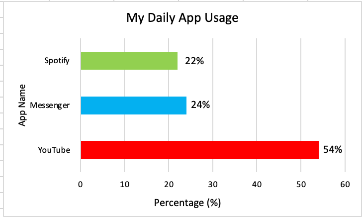
Here is a graph that doesn’t follow the low information to ink ratio model:

And here is a graph that does follow the low information to ink ratio model:

Review question:
Can you identify the differences between the two figures above?
What would you do differently if you were to make this figure on your own?
What is a good rule to follow when creating figures?
Leave a Reply